IF Feature Highlight: Group
Welcome back to our IF Feature highlight series. We hope you’re having a great week so far! Today we are focusing in on an extremely powerful collection within IntuiFace Composer called the Group, newly introduced in Version 4.0.
In the same way you can group elements on a Microsoft PowerPoint slide, you can group IntuiFace assets and collections together using the Group collection. This is particularly helpful when you want to aggregate assets into a logical or functional superset. Whenever the Group is moved, resized or duplicated, all the contained assets and collections react in concert together.
Uses include:
- Interactive product data sheets. Add combination of text, image, video and document assets. Populate on the fly with content using Interface Assets. Every time the data sheet is moved or resized, all embedded content reacts accordingly.
- Interactive maps. Place an image of a map in a collection and place point-of-interest markers on top of specified locations. Movement and zooming of the Group won’t disturb marker placement.
Here are some practical usage points for the Group collection in Composer:
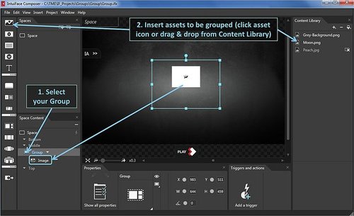
To add IntuiFace assets inside a Group, either:
1. Select a Group in the active scene then choose any asset type in the Insert menu or drag-and-drop any item from the Content Library on top of the Group.
2. Add an asset to the active scene and then drag its representation in the Space Content panel on top of the representation of a Group.
See the image below.

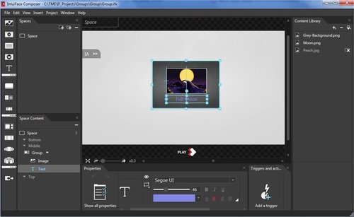
To edit Group content - to order, stack or resize individual assets - double-click the Group container in the scene. The space background turns grey and you now have access to each individual asset within the Group.
See the image below.

Groups have their own triggers and actions. We can imagine a simple scenario where we create two groups, with different content, whose visibility is activated via a toggle button. Watch the video below to see it in action.
IntuiFace – Group Visibility via Toggle Buttons
A nice value-add for the Group collection is the ability to decide how each embedded asset and collection should respond to a resize action on the Group as a whole. There are three choices:
1. Scale - Global scaling is performed on the asset, meaning even control buttons (like play, stop) for a video or the font size of text grows or diminishes proportionally with the size of the Group. Visually, this option fits expectations most closely. Everything changes.
2. Resize - The size of the container for the asset varies proportionally with the Group but the control buttons for a video or the font size of text are unaffected. Use of the Resize option is the same as if you were to manipulate each asset individually in the active Composer scene.
3. No Resize - Assets embedded in the Group are unaffected. Only the container size of the Group itself varies. All assets contained in the Group maintain a proportional distance from the Group’s central anchor point. Thus, if you zoom out of the Group, embedded assets will give the impression of radiating out from the center of the Group.
Have a look at the video below to better understand these sizing options (note that sizing effects only work during runtime and not during design time):
IntuiFace – Group Sizing Options
Disclaimer: If you have never used IntuiFace before, some of the supporting topics we discuss in this post may not be familiar to you. If this is the case, please refer to our Knowledge Base for explanation of specific concepts.
Have you used the Group collection yet? Why not give it a try in your next IntuiFace creation!


